
THE TRUTH ABOUT ANCEL KEYS: WE’VE ALL GOT IT WRONG
This post was written by Denise Minger, you can follow Denise’s fine work at https://deniseminger.com/
Note: This post was inspired by the “Ancel Keys” section in a recent series of paleo-challenging YouTube videos, which I may critique in the future. The anonymous videomaker “Plant Positive” highlighted some important misconceptions about Keys and his research that I’d like to broadcast to a larger audience, but didn’t address some equally important points tangled in the Keys saga, and likewise made some arguments I believe are incomplete or misleading. This blog post is an attempt to address those misconceptions in a more balanced and thorough way, and provide a broader context for how we view the infamous Mr. Keys.)
This is one of those “gotta bust me some myths no matter where they come from” blog posts. And by that, I mean I’m about to challenge a story that’s been so well-circulated among paleo, low carb, and real-food communities that most of us have filed it away in a little brain-folder called “Things We Never Have to Question Because They’re So Ridiculously True.”
I’m talking about the late, great Ancel Keys, and his equally late (but maybe not as great) role in the history of heart disease research. The oft-repeated tale goes something like this:
Once upon a time, a scientist named Ancel Keys did an awful thing. He published a study about different countries that made it look like heart disease was associated with fat intake. But the truth was that he started out with 22 countries and just tossed out the ones that didn’t fit his hypothesis! When other researchers analyzed his data using all the original countries, the link between fat and heart disease totally vanished. Keys was a fraud, and he’s the reason my mom made me eat skim milk and Corn Chex for breakfast instead of delicious bacon and eggs. LET HIS SOUL BURN. BURN! BUUUUUURN!
Depending on who tells the story, some of the details (and wishes for eternal hellfire) may differ. But in many cases, Keys’ infamous cherry-picking is attributed to his Seven Countries Study, a landmark project that helped sculpt our common beliefs about fat. Even the Seven Countries Study page on Wikipedia—the first hit when you Google “Seven Countries Study”—says that Keys shamelessly erased the data he didn’t like:
The study began with a great many more countries … but Keys deleted the countries whose results did not match his pre-conceived conclusions, leaving him with only Japan, Italy, Great Britain, Australia, Canada and the US. Full disclosure would have made a great deal of difference.
Ditto for the page on Ancel Keys himself:
Keys collected data on deaths from coronary heart disease and fat consumption from 22 countries. Despite the fact that 22 countries provided statistics, Keys cherry-picked the data from the 7 countries which supported his theory that animal fat was the main cause of coronary heart disease in order to publicize his opinions. The results of what later became known as the “Seven Countries Study” appeared to show that serum cholesterol was strongly related to coronary heart disease mortality both at the population and at the individual level.
…And we all know Wikipedia would never lead us astray. Other big-hitters in the nutrition blogosphere have repeated this version as well, dismissing the Seven Countries Study as manipulated bias, and claiming Keys’ theory fell apart once some discarded countries were added back in—making it all the more troubling that the study became so influential.
This, we’re told, is Keys’ cherry-picked graph:

The upward curve of doom.
And this, we’re told, is the graph with all 22 countries and a diminished fat-and-heart-disease association:

And this, we’re told, is the man who ruined the world:

Unfortunately, reality sometimes infringes on the things we’d prefer to consider “facts.” This is one such occasion.
The Truth:
- Ancel Keys did not drop any countries from the Seven Countries Study. His most famous graph—the first one up above—is from a different paper he presented at a World Health Organization (WHO) conference in 1955. The Seven Countries Study didn’t even launch until 1958, and entailed much more than just plopping numbers into a pretty curve. (That said, the Seven Countries Study had plenty of problems too; some are mentioned on this site.)
- Contrary to popular belief, the cherry-picked graph didn’t convince everyone that fat was evil. In fact, Keys was pretty much ridiculed for the weakness of his fat/heart disease theory by other scientists at the WHO meeting, and whenever his graph was cited in medical journals later on, it was usually paired with some criticism. Although Keys’ work definitely shaped our current beliefs about fat, this graph didn’t exactly take the world by storm. (More on this later.)
- When all 22 countries were analyzed, the association between fat and heart disease did not go away. It actually remained statistically significant (meaning it probably wasn’t due to chance). And to make matters worse, the paper frequently cited as a “rebuttal” to Keys shows pretty clearly that animal protein had an even stronger association with heart disease than total fat did. The China Study was right all along! Time to go vegan, you guys. (Just kidding. But this part is the most interesting of all, and we’ll examine it in excruciating depth in a moment.)
Although some of his saga has been misconstrued, Keys was still far from perfect—and his eventual role in demonizing saturated fats (while glorifying polyunsaturated fats) has led us down an unfortunate road. My goal is neither to nudge Mr. Keys into sainthood nor to perpetuate his villain status—only to lay out the history and data as objectively as possible.
Here’s the more detailed scoop.
The six-country graph
Let’s look at this sucker again—smaller now, to symbolize its diminished importance (and to ease the burden of scrolling):

Keys published this graph in 1953 in a paper called called “Atherosclerosis: A problem in newer public health” (which is apparently so brilliant that neither the abstract nor full text is allowed to exist online). It was simple, really: he graphed fat consumption alongside heart disease mortality in men from six different countries—and voila! The data points landed in a tidy little line. Keys first unveiled his Wonder Curve to a handful of people at Mt. Sinai Hospital in New York, but his most famous presentation was at that WHO conference a few years later.
Curiously, instead of rolling around on the floor possessed by fat-phobia demons, his WHO audience reacted with skepticism. One report says another researcher challenged Keys to describe his “best piece of evidence” for the diet-heart idea, and effectively squashed Keys’ argument with his Oxford-educated debate tactics. As a result, poor Keys never got to show all the WHOs down in WHOville the full reasoning behind his theory, and left the conference rather defeated. (At least he didn’t steal Christmas.)
But the debate humiliation was small potatoes compared to what came next. In 1957, Jacob Yerushalmy and Herman Hilleboe—Berkeley statistician and New York State Commissioner of Health, respectively, who’d both attended the WHO meeting with Keys—wrote a scathing critique of Keys’ beloved graph. Their paper was titled “Fat in the diet and mortality from heart disease: A methodological note.” This, my friends, is the rebuttal that gets cited near and far as proof of Keys’ fraudulence, and is the source of that “original 22 countries” graph we saw a bit ago.
It’s a pretty good paper, almost clairvoyantly identifying problems that would plague epidemiology for decades to come. And like most pretty good papers, I can’t link to it for free anywhere online. Which means I’ll be screen-shotting excessively from a copy Peter at Hyperlipidkindly sent me a few months ago. (Thanks, Peter!)
It starts out with a nugget of wisdom about “indirect” studies (e.g., playing connect-the-dots with observational data):
It is well known that the indirect method merely suggests that there is an association between the characteristics studied and mortality rates and, further, that no matter how plausible such an association may appear, it is not in itself proof of a cause-effect relationship. But quotation and repetition of the suggestive association soon creates the impression that the relationship is truly valid, and ultimately it acquires status as a supporting link in a chain of presumed proof.
True that, Yerushalmy and Hilleboe. True. That. But I realize we’re not here for wisdom nuggets; we’re here to learn the truth about Ancel Keys and his picking of cherries. Here’s where the paper gets interesting:
Since no information is given by Keys on how or why the six countries were selected [for his graph], it is necessary to investigate the association between dietary fat and heart disease mortality in all countries for which information is available.
That’s right, folks. At the time he made his six-country graph, Keys actually had access to a much larger database of food intake and mortality statistics for 22 countries. Why he chose only six will forever remain one of life’s great mysteries.
And thusly, we’re presented with this. The graph with all the original countries in their non-manipulated glory. Drumroll, please. (For purposes of suspense and unbridled excitement, pretend you didn’t already see this graph a few minutes ago.) Here we have…

…a less defined, but existent upward trend. Yeah, it’s still there.
But wait! Wasn’t this graph supposed to demolish the association between fat intake and heart disease among the 22 countries? Aren’t we told that was the epic discovery of this paper? Yerushalmy and Hilleboe concede that although Keys’ six countries “greatly exaggerated the importance of the association,” the full graph still shows that there’s “some association in the conventional sense between the two variables.” And as we’ll see shortly, that “some association” was actually quite large—a statistically significant r-value of 0.59 (p < 0.02), which is pretty hefty in math-speak.
So here’s what we’ve got so far:
- Keys cherry-picked six countries and never told us why.
- The cherry-picking was shameful and terrible and unscientific, but the fat/heart disease association among his six countries was also present in the full set of data. Keys didn’t just make it up.
I’m not going to pat Keys on the back for deliberately choosing countries to make his case look stronger, but in terms of historical accuracy, we can’t say that he actually lied. His biggest error, in fact, had less to do with data-deletion and more to do with tunnel vision. Along with failing to explore reasons why fat might be linked to heart disease in a non-causal way, it seems Keys had his eyes locked so tightly on his lovely lipids that he didn’t notice the role of other dietary factors.
And indeed, this is where Yerushalmy and Hilleboe really hammer the heck out of Keys (he could surely never open a door again). In their paper, they explain that—in order to gauge whether the fat-heart disease relationship is really noteworthy—we also have to look at the relationship between heart disease and other elements of diet. Is fat as a category really the strongest link? Certain subsets of fat? A different macronutrient altogether? What’s the deal?
Luckily, the paper supplies us with a chart answering those very questions, using the same data Keys drew from. Apologies for the crookedness of it all. (Edit: A huge thank-you to Tynan Smithfor removing said crookedness and emailing me the improved version below!)
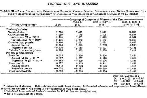
There’s a lot going on here, so for now, let’s just look at that first column that says B-26. That’s neither a vitamin nor a rock band: it’s the official classification for “arteriosclerotic and degenerative heart disease,” which is the mortality category Keys used in his six-country graph.
To make it a little easier to prune through, here’s the B-26 column typed out. Values higher than about 0.43 (or less than -0.43) are considered statistically significant, meaning the association is very likely to be valid and not just due to random chance. Positive numbers indicate a positive correlation—heart disease goes up hand-in-hand with the food variable. Negative numbers indicate an inverse correlation—heart disease goes down as the food variable goes up.
- Total calories: 0.723
- Total calories from fat: 0.659
- Total calories from animal fat: 0.684
- Total calories from vegetable fat: -0.236
- Total calories from protein: 0.709
- Total calories from animal protein: 0.756
- Total calories from vegetable protein: -0.430
- Total calories from carbohydrate: 0.305
- Percent of calories from fat: 0.587
- Percent of calories from animal fat: 0.677
- Percent of calories from vegetable fat: -0.468
- Percent of calories from protein: 0.172
- Percent of calories from animal protein: 0.643
- Percent of calories from vegetable protein: -0.651
- Percent of calories from carbohydrate: -0.562
No use in beating around the bush. After statistic-ifying all 22 countries, Yerushalmy and Hilleboe found that not only was “fat as percent of total calories” still associated with heart disease (r = 0.59), but animal fat was clearly driving that correlation. In fact, plant fat had a negative association with heart disease (-0.47) while animal fat was uber positive (0.68). And to rub salt into the wounds of omnivores everywhere, the animal protein/plant protein division was equally stark: animal protein as a percent of total calories had a correlation of 0.64 with heart disease, while plant protein had an inverse correlation of -0.65.
In number-free language, this means the countries eating more animal foods were—as a general trend—reporting more deaths from heart disease.
As with any observational data, this doesn’t tell us diddly squat about cause and effect. Drawing correlations between countries is particularly risky because of massive confounding that’s almost impossible to account for. But if we’re going to be honest about these specific numbers, a heart disease/animal food relationship is very much there.
Oh, the irony. The fat Keys focused on for his 1953 graph was basically a reflection of meat and dairy. We’ve lambasted him for not using all the available data, but if he had, he might’ve turned his “correlation is causation” laser-gaze onto animal foods and plumb gone vegan.
Come join us, Ancel.
In fact, the relationship with heart disease and animal foods rather than “fat as a percent of total calories” becomes even more obvious when we improve the data a bit. Yerushalmy and Hilleboe—those perceptive fellas—note that the countries with the lowest rates of “death from arteriosclerosis and degenerative heart disease” had suspiciously high rates of “death from other diseases of the heart” (or B-27, if you want to get fancy):

Odd, oui? Yerushalmy and Hilleboe offer the most logical reason:
…unless there is a reasonable explanation for the high rates in these countries in this less definitive group of “other diseases of the heart,” it may be safer to operate on the assumption that in these three countries [Chile, Mexico, and France] some deaths from arteriosclerotic and degenerative heart disease are being recorded under the broad group of “other diseases of the heart.”
Indeed, classifying heart disease deaths was pretty inconsistent in the mid-1900s—and even today, “death coding” practices vary widely between countries. To get a more accurate picture, Yerushalmy and Hilleboe recommend combining the “death from arteriosclerotic and degenerative heart disease” with “other diseases of the heart,” instead of using only B-26 like Keys did. And when we do that, our correlations shift a bit. Here’s the “B-26 + B-27” column from two charts ago:
- Total calories: 0.593
- Total calories from fat: 0.470
- Total calories from animal fat: 0.562
- Total calories from vegetable fat: -0.282
- Total calories from protein: 0.694
- Total calories from animal protein: 0.695
- Total calories from vegetable protein: -0.153
- Total calories from carbohydrate: 0.423
- Percent of calories from fat: 0.390
- Percent of calories from animal fat: 0.557
- Percent of calories from vegetable fat: -0.509
- Percent of calories from protein: 0.465
- Percent of calories from animal protein: 0.608
- Percent of calories from vegetable protein: -0.483
- Percent of calories from carbohydrate: -0.386
Nearly all the correlations got weaker, but Keys’ favorite variable—”percent of calories from fat”—dropped off into statistical-insignificance land. Animal fat and protein, however, remained strongly associated with heart disease deaths. (Gasp shock horror!)
(Note: Even though adding “other diseases of the heart” to the mix probably gives a better picture of heart disease trends, it’s quite possible—maybe inevitable—that the mortality data is still skewed for some of the “healthiest” looking countries. A WHO paper called “Miscoding and misclassification of ischaemic heart disease mortality” (PDF) points out that countries like Japan, France, and Portugal have historically been “high ill-defined coders,” meaning they dump a large portion of heart disease deaths into the wrong category. This is typically because of insufficient diagnostic methods (especially for low-income countries), local medical practices (such as Japan’s tendency to write off coronary heart disease as “heart failure”), or simple physician error. Interestingly, the WHO paper also notes that the apparent rise in heart disease as countries become “more developed” is probably due to better classification on death certificates rather than an actual increase in the disease.)
But the story’s not over yet, folks.
Yerushalmy and Hilleboe ramp it up a notch by posing the question: “How does fat (and by extension, animal food variables) relate to other causes of death?” We’ve seen what happens with heart disease, but there are certainly many other ways for the human body to perish. Are the folks eating more fat, animal fat, and animal protein generally dropping faster than their more plant-focused counterparts?
Time for another table. Omnivores, wipe away your tears. Vegans, put away your kazoos. The playing field’s about to change.
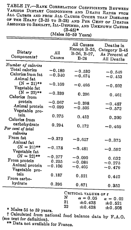
Let’s look, first, at that middle column—deaths from everything other than diseases of the heart. Notice a pattern?
- Total calories: -0.530
- Total calories from fat: -0.674
- Total calories from animal fat: -0.466
- Total calories from vegetable fat: 0.296
- Total calories from protein: -0.398
- Total calories from animal protein: –0.505
- Total calories from vegetable protein: 0.452
- Total calories from carbohydrate: 0.172
- Percent of calories from fat: -0.657
- Percent of calories from animal fat: –0.481
- Percent of calories from vegetable fat: -0.090
- Percent of calories from protein: -0.080
- Percent of calories from animal protein: -0.405
- Percent of calories from vegetable protein: 0.521
- Percent of calories from carbohydrate: 0.671
We’re basically staring at the reverse image of that earlier heart disease chart. Fat now has the strongest negative association with mortality out of any variable—a whopping -0.674 for “total calories from fat” and -0.657 for “percentage of calories from fat” (highlighted in purple). Animal fat and animal protein, but not plant fat or plant protein, are also strongly negatively associated with non-heart-disease mortality. You may notice, too, that the folks with a higher percent of calories from carbohydrate had the greatest mortality in this age range.
Even if we look at the first column for “death from all causes”—which is a little less impressive, because none of the numbers reach statistical significance—we see that all of the animal food correlations are negative. The only positive correlations, weak as they may be, are with plant protein and carbohydrates.
The results are clear. When we look at “non-cardiac deaths,” it’s the folks eating more animal fat and animal protein who are stayin’ alive. And when we look at overall mortality, animal foods sure don’t seem like stealthy killers.
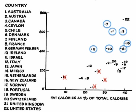
Out of curiosity, I tried graphing the life expectancy for the countries in 1950 against their fat intake to see what would happen. Considering that the bulk of each nation’s fat intake came from animal sources, plotting animal food against life expectancy would probably turn out similar. (Life expectancy data taken from EarthTrends.)
Although the dots are pretty scattered when fat intake is below 25% of calories, the trend becomes unmistakable once that number passes 30%: countries with higher average fat intake had the longest life expectancies.

But does any of this—the life expectancy graph and the “death from other causes” table—prove that eating more fat and animal foods makes you live longer, or eating more carbohydrates makes you die sooner? Heck to the no. Same goes for interpreting the animal food/heart disease relationship in this data as a reason to go veggie. Yerushalmy and Hilleboe explain precisely why we shouldn’t assign a cause-and-effect relationship to anything we’ve seen so far (emphasis mine):
Table IV shows that fat calories and animal protein calories, which were seen above to be positively associated with heart disease, are here negatively associated with noncardiac diseases. A … plausible explanation is that the dietary components which according to the rank correlation coefficients appeared to be positively related to heart disease are indices of the various countries. That is, it may be that the amount of fat and protein available for consumption is an index of a country’s development, industrially, nutritionally, medically, and no doubt in other respects as well.
Bingo. Intake of fat and protein—particularly from animal sources—is usually a proxy for a country’s development. These foods goes hand-in-hand with other features specific to industrialization, making their relationship with disease likely to be confounded. Continuing on:
It may also be that countries with more abundant diet are more high developed and diagnostic acumen is greater. Hence, it is possible that in some of the countries in which less protein and fat are available, a certain percentage of deaths from arteriosclerotic and degenerative heart disease are recorded under the non cardiac groupings.
Bingo again. As we saw in the WHO paper I referenced earlier (PDF), diagnostic patterns vary tremendously between countries. This paper even points out that the countries with the highest apparent rates of coronary heart disease often have the most valid death classifications as well. In fact, if we X-out the countries with the worst track record for classifying heart disease and circle the countries whose accuracy was nearly perfect, our 22-country graph looks pretty striking. (Mexico gets an X because it didn’t even have a death-certificate system until the late 1950s (hat tip to Plant Positive for noting this on his Primitive Nutrition videos). Ceylon/Sri Lanka and Chile—numbers 4 and 5 at the bottom—aren’t mentioned in the WHO paper one way or another, but I imagine they deserve some Xs too.)
Keep in mind that the WHO paper looks at mortality data for the ’70s through ’90s, while the graph above uses mortality data from 1948 and 1949. It’s possible that some of the countries improved their death-classifying practices in the decades between, so this graph should be taken with a grain of salt. Especially if you have low blood pressure.But back to Yerushalmy and Hilleboe for a moment because they’re so awesome:
Moreover, as Table IV shows, there are appreciable negative correlation coefficients between dietary components and death rates from B-45 (“senility, ill-defined and unknown causes”). The latter category may be considered a rough index of the accuracy of cause of death certification in the different countries. The negative association with protein and fat is further evidence of the non-“specificity” of the presumed association.
Indeed, if we glance at that third column from a couple graphs ago (click here to open it in a new window so you don’t get lost in scrolling-limbo), we’ll see that animal food variables have strong inverse associations with this death category, while the plant food variables have strong positive associations with it. Senility, ill-defined, and unknown causes are the equivalent of a doctor saying “Gee, I dunno why this person died so I’ll just file them away under one of these vague, essentially meaningless categories!” Such a scenario is much more likely in an under-developed area with shoddy medical care than an industrialized country with more diagnostic precision.
I wanted to explore this issue even further, so I dug up some data for each country’s gross domestic product (GDP) per capita in 1950. This is the measure of a country’s economic output divided by the population, and is a pretty good way to estimate standard of living. (Numbers taken from NationMaster; Israel and Ceylon/Sri Lanka are omitted because I couldn’t find their data from this year.)

So there we have it: more kindle for the idea that fat intake generally reflects a nation’s economic status and level of industrialization, and is hence vulnerable to confounding. (Or maybe correlation really is causation, and inhaling sticks of butter will make your country richer! Only one way to find out…)
One final, super-important point that could quite possibly render everything else useless: The diet data for our 22 countries comes from F.A.O. food balance sheets—which show how much food was available for consumption in each country, rather than how much food was actually consumed. If this sounds like a totally weird and unreliable way to measure what people eat, that’s because it is. Yerushalmy and Hilleboe explain the problem further:These indices were constructed by the Food and Agriculture Organization of the United Nations from statistics on production, imports, exports, and on the proportion of available food used for purposes other than human nutrition. The underlying data are stated by F.A.O. to be subject to great limitations. Moreover, there are no doubt great differences in food “scraps” in the various countries compared. For example, it is highly probable that far more edible dietary fat is thrown into waste cans in the United States than in less fortunate countries.Dur. Although this doesn’t mean the data for the 22 countries is bogus, it does mean the fat intake (as well as total calories) for wealthier nations may be overestimated. Maybe by a lot. Indeed, there’s a strong connection between how abundant food is and how much of it we waste.
That about covers it for the Yerushalmy and Hilleboe paper. Isn’t it neat that we just did a deeper analysis of the 1950s data than Keys himself probably did? Here’s a summary of the major points in case your eyes glazed over for any of that:
- Yep, Keys picked some cherries—but a link between fat intake and heart disease mortality existed among all 22 countries, not just his six-country graph. And as Yerushalmy and Hilleboe’s paper revealed, the real force behind that correlation was animal fat intake, not just fat as a general category. Keys definitely should’ve facepalmed himself for not looking at the data more carefully, but even if he’d been scrupulous, he probably still would’ve launched the anti-saturated-fat crusade that defined his later career.
- Although total fat, animal fat, and animal protein were associated with heart disease in this data, those variables were associated with less death from pretty much everything else. Overall, the countries with higher fat and animal food intake had longer life expectancies than the rest. This doesn’t prove that animal foods make you immortal or that plant foods will slit your throat in the middle of the night: it’s mostly a result of countries with more money and a higher standard of living tending to eat more animal products (along with having lower rates of infectious disease, better health care, diets higher in industrially processed foods, and so forth). There’s so much confounding involved with this subject that I don’t even wanna touch it with a ten-foot statistical pole.
- A lot of countries suck at classifying heart disease deaths under the right label. Especially less-developed nations with sketchy medical care. This makes it look like some countries have abnormally low rates of heart disease, when in reality, they just have abnormally high rates of messing up.
- The F.A.O. data that Keys (and others of his time) used is probably the most inaccurate way to measure food consumption ever invented. Because food-balance data doesn’t account for stuff people throw away, wealthier countries are always going to look like they have a higher intake of pretty much everything compared to poorer countries. It’s impossible to say how much this influenced the link between fat or animal foods and mortality rates, but the impact might’ve been pretty big.
- Correlation isn’t causation. Correlation isn’t causation. Correlation isn’t causation. Correlation isn’t causation. Correlation isn’t causation. Correlation isn’t causation. Correlation isn’t causation. Correlation isn’t causation. Correlation isn’t causation. Correlation isn’t causation. Correlation isn’t causation. Correlation isn’t causation. Correlation isn’t a cucumber. (Just making sure you’re awake.)
Now back to Keys. I’m mostly interested in clearing up the confusion about the Yerushalmy and Hilleboe paper and what it really showed about Keys’ cherry-picked graph, so I’m not going to tweeze through the rest of his work with the same Aspergers-esque detail. (At least not in this blog post—the real Seven Countries Study probably deserves an eventual skewering.) But I do want to address something interesting about Keys that many people aren’t aware of, which is…
Keys on dietary cholesterol: one thing he got right
Although Keys was staunch in his belief that saturated fat causes heart disease by raising blood cholesterol, he was one of the brave few who insisted that dietary cholesterol was pretty much irrelevant. Thanks to a slew of early animal experiments—such as Nikolai Anitschkow’s famous rabbits—that used dietary cholesterol to induce atherosclerotic lesions, implicating dietary cholesterol with heart disease was all the rage for a while. For a long while, actually, considering how many folks today still to dump their egg yolks down the drain.
But Ancel didn’t buy it. In his paper “Human atherosclerosis and the diet” (PDF), he writes that “from these animal experiments only, the most reasonable conclusion would be that the cholesterol content of human diets is unimportant in human atherosclerosis.” Likewise, in some of his metabolic ward studies, Keys found that altering dietary cholesterol in the context of a normal diet had only minor effects on blood cholesterol, concluding that “attention to this factor alone accomplishes little.” And in his paper “The relationship of the diet to the development of atherosclerosis in man,” Keys is pretty clear about his views:
The evidence—both from experiments and from field surveys—indicates that the cholesterol content, per se, of all natural diets has no significant effect on either the serum cholesterol level or the development of atherosclerosis in man.
Good for him.Paragraph
And since I probably won’t write any more blog posts until 2012 (unless someone surgically implants a new month between December and January), I want to use this final paragraph to tell everyone who reads this blog that I love you and appreciate your readership more than you could possibly imagine. I’m continually astounded that you guys not only bear with me through my sporadic blogging habits, but also create such awesome dialogues in the comment section. You people rock my world. If I were wearing socks right now, those would be rocked, too. I really mean it. Have a wonderful new year, everyone!
This post was written by Denise Minger, you can follow Denise’s fine work at https://deniseminger.com/


Recent Comments